
Why the wave went
The old icon was a cresting wave. It served the app well, but it said beach and surf more than it said planning, and wave icons are everywhere in the app stores. When we rebuilt every screen of the app for v3.0.0, the wave was the last piece of the old look left.
 Before
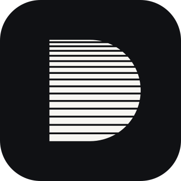 After
Dive Kit is a planning tool. It runs a decompression model, shows you the numbers and tells you where they come from, so you can check them against your computer, your tables or a second planner. We wanted a logo that belongs to that job: plain, exact, one colour, and built from something real instead of a picture of the sea.
Finding the idea
We went through a dozen directions first: a cleaner version of the old wave, a nautilus shell, a D cut into deco stops, a diver-down flag, a harness D-ring, bubbles sized by Boyle's law and more. Most were either too literal or too far from what the app does. The idea we kept came straight out of the model the app runs.
Sixteen compartments, sixteen bars
Bühlmann's model does not track your body as one thing. It splits it into sixteen theoretical tissue compartments, each taking up and releasing inert gas at its own speed. A compartment's speed is its half-time: the time it takes to close half the gap between the gas it holds and the gas you breathe. The fastest compartment in ZH-L16C has a nitrogen half-time of 4 minutes. The slowest has 635.
The mark gives each compartment one bar. Compartment 1 is at the top and compartment 16 at the bottom, in the order a planner or a dive computer lists them. Together the bars make the letter D.
Why the bars get thicker
If the bars were drawn in proportion to their half-times, the bottom one would be about 159 times the top one, and the top bar would vanish. So each bar is as thick as the base-2 logarithm of its half-time instead. The thinnest bar is then 2 units and the thickest 9.31, about 4.7 times as thick, and every bar stays visible.
The base-2 logarithm also has a plain meaning: it counts doublings. Compartment 2's half-time is twice compartment 1's, so its bar is one unit thicker. Compartment 16's half-time is a little over seven doublings of compartment 1's, so its bar is a little over seven units thicker.
| Compartment | N₂ half-time | Bar weight (log₂) | Relative to bar 1 |
|---|---|---|---|
| 1 | 4 min | 2.00 | 1.00× |
| 2 | 8 min | 3.00 | 1.50× |
| 3 | 12.5 min | 3.64 | 1.82× |
| 4 | 18.5 min | 4.21 | 2.10× |
| 5 | 27 min | 4.75 | 2.38× |
| 6 | 38.3 min | 5.26 | 2.63× |
| 7 | 54.3 min | 5.76 | 2.88× |
| 8 | 77 min | 6.27 | 3.13× |
| 9 | 109 min | 6.77 | 3.38× |
| 10 | 146 min | 7.19 | 3.59× |
| 11 | 187 min | 7.55 | 3.77× |
| 12 | 239 min | 7.90 | 3.95× |
| 13 | 305 min | 8.25 | 4.13× |
| 14 | 390 min | 8.61 | 4.30× |
| 15 | 498 min | 8.96 | 4.48× |
| 16 | 635 min | 9.31 | 4.66× |
These are the ZH-L16C nitrogen half-times our engine uses, with the 4-minute first compartment. Helium has its own, faster half-times in the same sixteen compartments; the mark uses the nitrogen set.
What the mark does not say
The bars are not a tissue graph from a dive. They do not show how loaded any compartment is, and the D is not a schedule. The mark draws the structure of the model, the sixteen compartments and their speeds, and nothing more. It is a reminder of what the app calculates, not a claim about any plan.
One drawing at every size
The same sixteen-bar mark is used everywhere, from the App Store listing to a browser tab. There is no simplified version for small icons: sixteen is the point.
One typeface, one palette
The wordmark is set in Archivo, the typeface of the v3.0.0 app, in its wide cut at a bold weight. The website now uses Archivo too, so the logo, the app and the site share one family. Russian pages use Roboto Flex, because Archivo has no Cyrillic letters, and figure captions keep a monospaced face so numbers line up.
The logo itself has no colour. It is ink on paper or paper on ink, so it works on a phone, a T-shirt or a wet slate. The brand has one accent colour, a blue the app uses for anything you set yourself, and the website uses the same blue.
What stays the same
Nothing about your plans changes. The engine, the tools, the numbers and your saved data are the same as before the new icon. Only the look is new.

